AlUla SC
A New Era for AlUla Sports Club
A New Era for AlUla SC
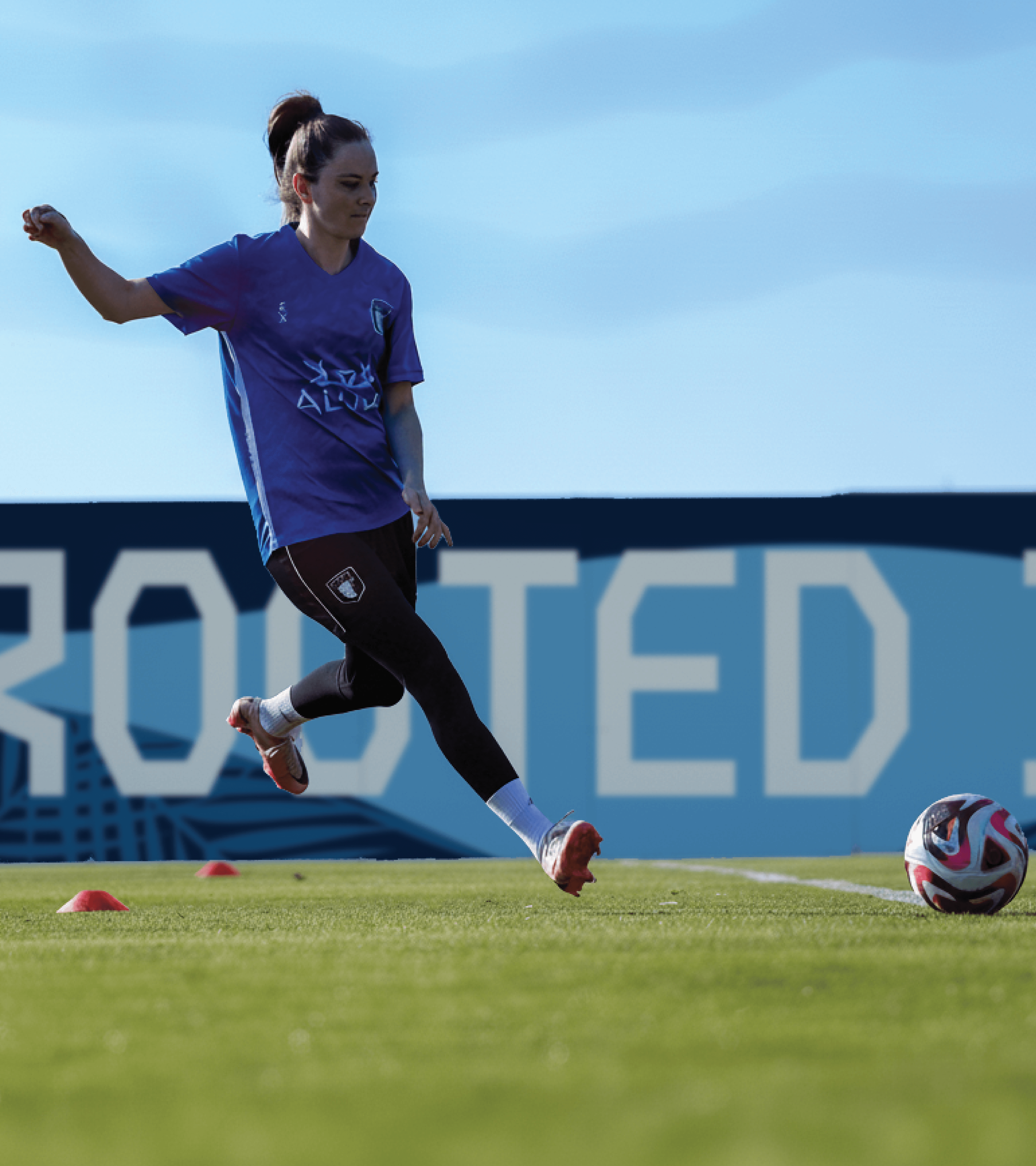
AlUla Sports Club sits at the crossroads of heritage and high performance. Our work brought their evolving identity to life—translating the spirit of AlUla into a modern sports brand built for athletes, communities, and the future of the region. This case study explores how we shaped a unified visual language, elevated their story, and created the tools for a club ready to grow on every front.
Born from AlUla's Landscape
Rooted in AlUla’s natural and cultural landscape, the graphic elements draw directly from the region’s most iconic forms. From the Arabian leopard to shifting dunes and oasis patterns, each element translates AlUla’s identity into a contemporary visual language that feels authentic, symbolic, and alive.


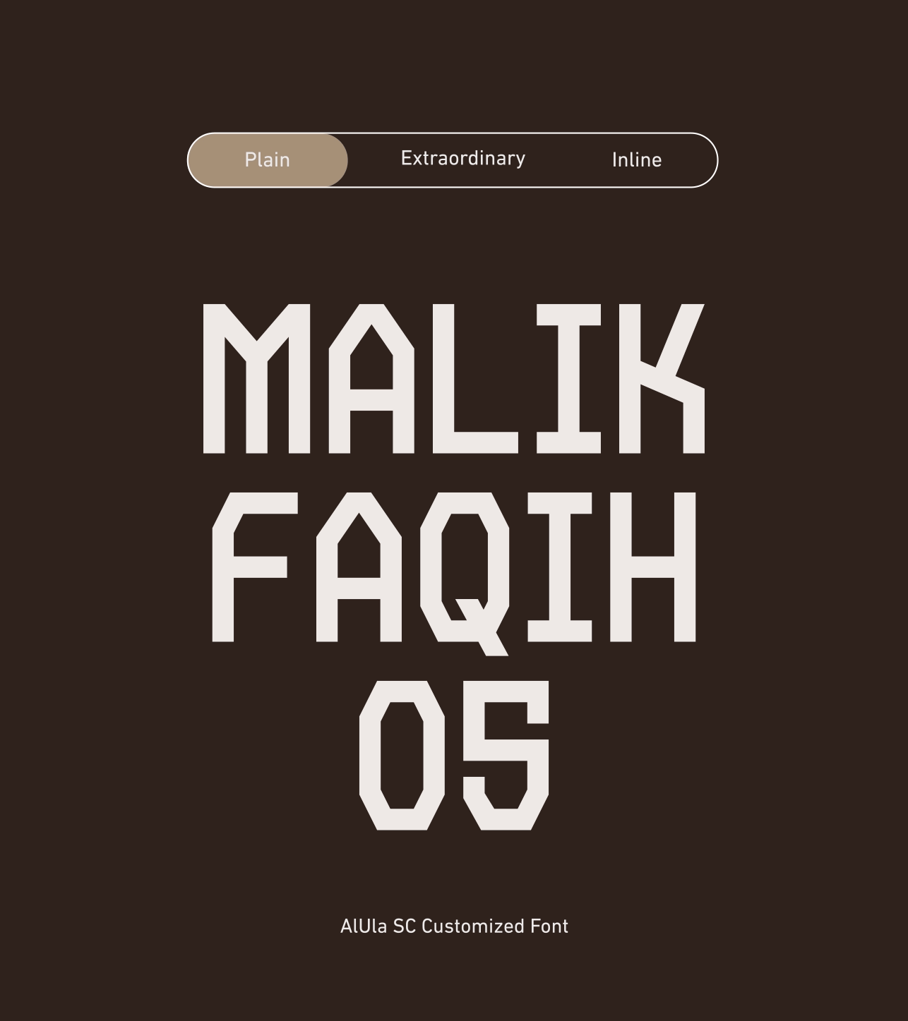
Written in AlUla
A bespoke typeface was created to express AlUla SC’s identity through form and rhythm. Inspired by the landscape and cultural character of AlUla, the letterforms balance strength and elegance, giving the club a distinctive voice that is instantly recognizable. The custom typeface unifies all communications, adding consistency, character, and a sense of pride across every touchpoint.


Bringing the Brand Into the Space
The interior branding of AlUla SC Headquarters translates the club’s visual identity into a physical experience. Through architectural graphics, patterns, and typography applied across walls and spaces, the headquarters reflects AlUla’s heritage while fostering a strong sense of pride, unity, and belonging for players, staff, and visitors alike.
Next up
Rotana Signs
Transforming the Face of Outdoor Media
©2025
Visual Identity Design